

UX Strategy • A/B Testing • UI Design • 10 min read
Closing 15%+ annual target in last 20 days for a $1B client
Before the end of FY2026, the client asked us to close out their annual target. We were tracking behind the promised number by roughly a sixth, and if we didn't close the gap, we'd lose the account.
Discovery phase
Data analysis
Pulled GA4 and session data across the booking funnel to find where revenue leaked, which pages lost users, and which segments carried the most upside.
UX Audit
Walked the booking flow end to end against UX frameworks, flagging friction in pricing clarity, trust signals, and decision points.
Competitor Analysis
Benchmarked luxury hotel booking sites to see how rivals handled scarcity, social proof, and price transparency, then mapped the gaps worth testing.
Data analysis
I used GA4 to map how users actually moved through the product, from the hotels page to booking confirmation. I started there because it is the primary entry point and carries the highest volume of sessions.

All figures shown are indicative. Actual numbers have been altered to protect confidential company data.
Key Observations
The hotels page gets the highest traffic, but more than 90% of visitors drop off before reaching checkout. The room reservation and personal details pages are the most concerning, since they have the highest drop-off and returning rates.
The personal details page had a notably high return rate, with visitors going back to the room selection page and the hotels page.
Of the two, visitors spent more time engaging with the hotels page than the room selection page.
Visitors return to the hotels page more often from the personal details page than from the room reservation page.
On both the room reservation and personal details pages, a significant number of visitors go back before converting, likely cutting into booking completion.
UX Audit
I reviewed each page in the journey to understand what our user would perceive at each step, and to surface their goals and pain points along the way.
USer goals
Pick a room, feel settled about it, and not have to reconsider the choice halfway through booking
See the full amount while still choosing, so the budget question is answered before any effort is spent
Have something on the page that separates near-identical rooms, so the decision does not rest on guesswork
Trust that the price shown is the price meant, with no small print waiting further in
User Pain points
A figure was settled on at the start, then a different one appears once the booking is already underway
Four rooms at a similar price, all sounding equally good, with no way to tell which one is the right call
Pressure to book now reads as a sales tactic, and makes the whole page feel less trustworthy
Details half-entered, then the sums have to be redone. Easier to close the tab than start again
The personal details page is where users are asked for personal information, yet nothing in the funnel rewards them for it.
Competitive landscape
I audited how competitors structured their room-selection pages, looking for layout and interaction patterns that resolved friction points. Before adapting any of them, I made sure we could first validate that our own page had the underlying usability problem those patterns were designed to solve.
Key Observations
3 out of 7 competitors (JW Marriott, The Leela, Oberoi) show full hotel identity, address and phone, on the room selection page itself.
3 out of 7 competitors (JW Marriott, Aman, Jumeirah) hide rates behind a second click, room first, price after. The other 4 (Four Seasons, The Leela, Shangri-La, Oberoi) show priced rate plans directly on the room card.
3 out of 7 competitors (JW Marriott, Four Seasons, Shangri-La) hide taxes and fees behind an opt-in toggle, unchecked by default. The other 4 state it in plain text next to the price.
3 out of 7 competitors (Four Seasons, The Leela, Shangri-La) show the cancellation policy right on the rate card. The other 4 hide it behind a separate details link.
3 out of 7 competitors (The Leela, Shangri-La, Oberoi) surface a loyalty or member rate in the default list, nudging sign-in before the room is even chosen.
Only 2 out of 7 competitors (The Leela, Shangri-La) use room scarcity messaging like "Only X rooms left" at the rate selection stage.
Planning & structuring
Based on observations across all three aspects, I drafted a plan to close the 15% shortfall.
The room reservation and personal details pages have the most room to improve, since most drop-offs happen there.
Prioritise UX tests backed by analytics data and real user patterns over simply mirroring competitors.
Surface-level UI changes alone will not move the needle.
TEST 0: Whats the offer
Room selection page
GOAL To decrease the number of visitors returning from room resrevation page to hotels page
WHAT I NOTICED
To find the most convincing element on the hotels page, I analyzed each tab's contribution to conversion. 'Rooms & Suites' drew the most traffic but converted at a lower rate, while 'Offers' converted at the highest rate despite far less traffic, suggesting Rooms & Suites users were mostly exploring, while Offers users arrived more decided.
HYPOTHESIS
If we surface live offers on the room selection page, then users' intent to complete their reservation will increase, because visibility into active discounts reduces uncertainty and helps them decide faster.

All figures shown are indicative. Actual numbers have been altered to protect confidential company data.
TEST RESULTS
after 5 days
Target covered
+ 15%
Learnings
Presenting deals and other action-driving elements improves overall bookings. Visitors unaware of active deals are less likely to complete their reservation than those who are aware, and burying that information makes it harder for visitors to find what matters and decide quickly. Surfacing deals on the page where visitors take their first action, the point where they're already putting in cognitive effort to find the right room, gives them a clear criterion for what makes one option better than another.
TEST 1: Daily Essentials
Room selection page
GOAL To decrease return rate of visitors from Room selection page to hotels page.
WHAT I NOTICED
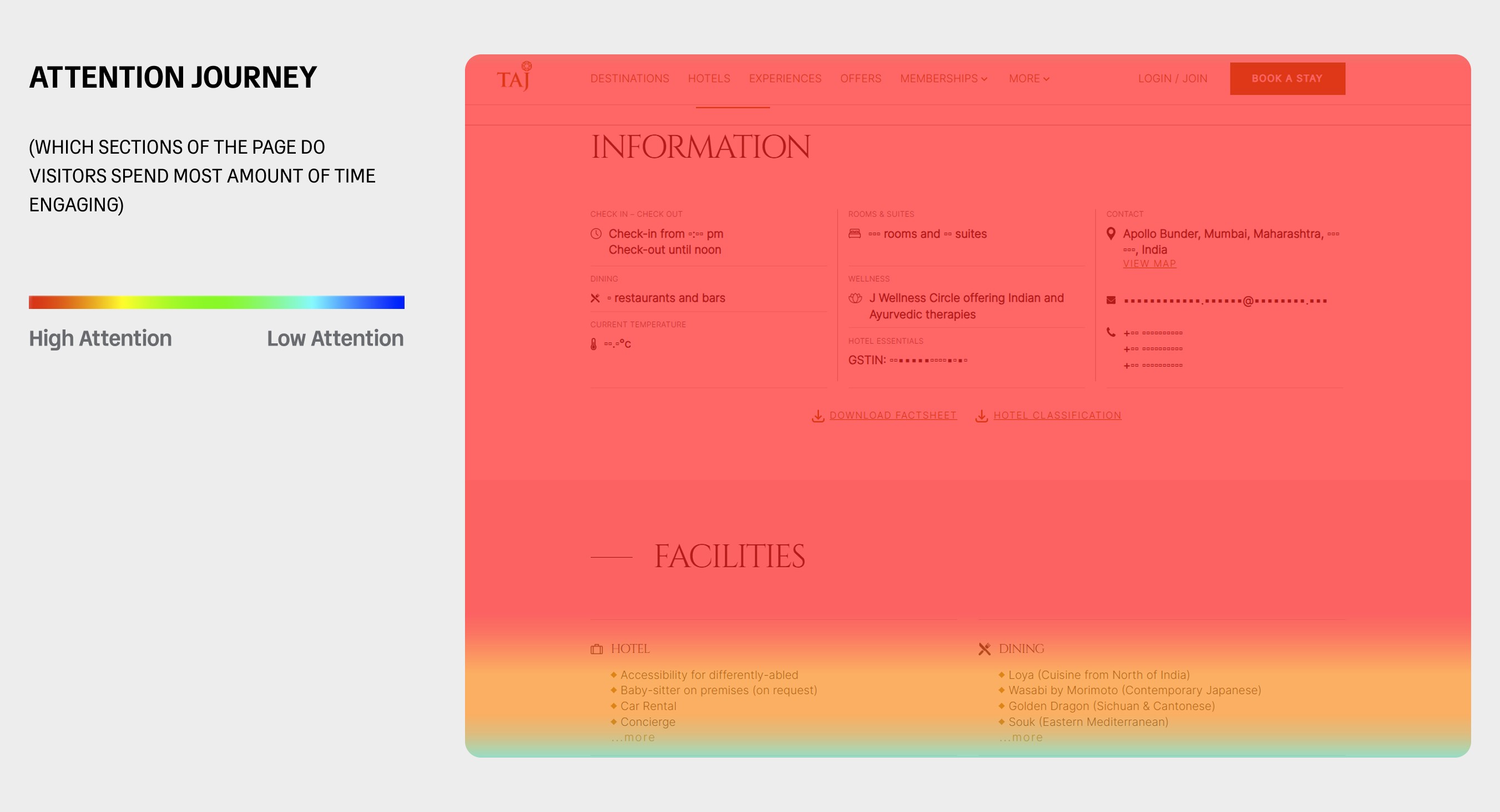
Of all the sections on the hotels page, Hotel Information and Facilities had the highest CTR and engagement time (confirmed in MS Clarity). The specific details users clicked on, address, contact number and email, were the same ones competitors surface on their own pages.
HYPOTHESIS
If we surface Hotel Information and Facilities on the room selection page, visitors can get what they need without leaving the flow. Today only the ones who backtrack to the hotels page ever find these details. Bringing them forward means fewer trips back and more confidence to keep going.
All figures shown are indicative. Actual numbers have been altered to protect confidential company data.
TEST RESULTS
after 5 days
Target covered
+ 12.5%
Cumulative Target
15% + 12.5%
27.5%
Learnings
Visitors are more likely to complete a reservation when the room selection page carries the information they would otherwise go back to the hotels page to find. The facilities section had a high CTR, but only among visitors who knew to look for it. Those who never found it were left booking on incomplete information, and some dropped off because of it. Putting the crucial details in front of them, at the point where they are deciding, keeps them in the flow instead of sending them off to hunt for it
TEST 2: Social beings
Room selection page
GOAL To reduce time spent exploring and increase conversion from room selection to personal details.
WHAT I NOTICED
When two or more rooms fell within the same price bracket, there wasn't enough on the page to help users tell them apart or judge their relative value. In the past, we had tested USPs based on aspects like window views, spa access and other room-level facilities, and these performed well for us. So this time I decided to add social proof that nudges users towards a specific room, cutting down exploration time and boosting booking confidence.
HYPOTHESIS
If we show a social proof tag such as "Popular among guests" or "High in demand" on the top 5 rooms that have driven the highest revenue and bookings, users will be able to decide faster, based on the experience of people who have booked with Taj before.

All figures shown are indicative. Actual numbers have been altered to protect confidential company data.
TEST RESULTS
after 10 days
Target covered
+ 55%
Cumulative Target
27.5% + 55%
82.5%
Learnings
Visitors could now tell which rooms guests like them had actually been booking, rather than guessing from price alone.
We assigned the tag on transactions and revenue together, not conversions alone. Ranking purely by conversions pushed the five cheapest rooms to the top and left out the suites entirely. Adding revenue brought the suites back in, since they sell in smaller numbers but account for a large share of income.
The Popularity tag drew far more interest than High in Demand. Visitors responded to what peers like them were choosing; High in Demand only signalled scarcity, which can read as manufactured urgency.
TEST 3: Daily Essentials
Personal details page
GOAL To decrease return rate of visitors from personal details page to hotels page.
WHAT I NOTICED
I looked at what visitors were doing when they returned to the hotels page from the personal details page, and found they were spending an average engagement time of 7 seconds before some of them came back to the room selection page. I then checked the attention map for the hotels page to see where a user would be after 7 seconds. It pointed to the second fold, where the hotel highlights sit.
HYPOTHESIS
If we show the hotel highlights on the personal details page, users can see what they are getting for the price before they commit. The idea is to make the amenities visible at the moment the cost feels highest, so the price reads as justified rather than steep.

All figures shown are indicative. Actual numbers have been altered to protect confidential company data.
TEST RESULTS
after 5 days
Target covered
+ 5%
Cumulative Target
82.5% + 5%
87.5%
Learnings
Showing users what justifies the price does two jobs at once. It defends the cost, and it reminds them what they are actually buying, the spa, the window views and the other facilities that make the stay worth it. The personal details page is the right place for this. It is the first point where users have to stop and enter information, which takes real effort, so having a reminder of the experience alongside the form keeps them motivated to finish.
TEST 4: Surprise Sur-price
Room selection page
GOAL To decrease the return rate from personal details and checkout back to room selection.
WHAT I NOTICED
The return rate was significantly higher on desktop than on mobile, which suggests that the desktop version surfaced information mobile users never saw. I also noticed that the return rate from checkout back to the personal details page was higher on mobile.
HYPOTHESIS
If we show a tooltip near the total price reading "+ INR XXX taxes and fees", users will know the full cost upfront, which should stop them from backtracking to re-check the price and let them move ahead with confidence in a more transparent process.

All figures shown are indicative. Actual numbers have been altered to protect confidential company data.
TEST RESULTS
after 5 days
Target covered
+ 40%
Cumulative Target
87.5% + 40%
127.5%
Learnings
Users want the total price in front of them while comparing rooms. When a new price appeared on the personal details page, visitors went back a step to reconsider their choice with taxes and fees factored in. A transparent process removes that backtracking and the surprise that causes it.
Conclusion
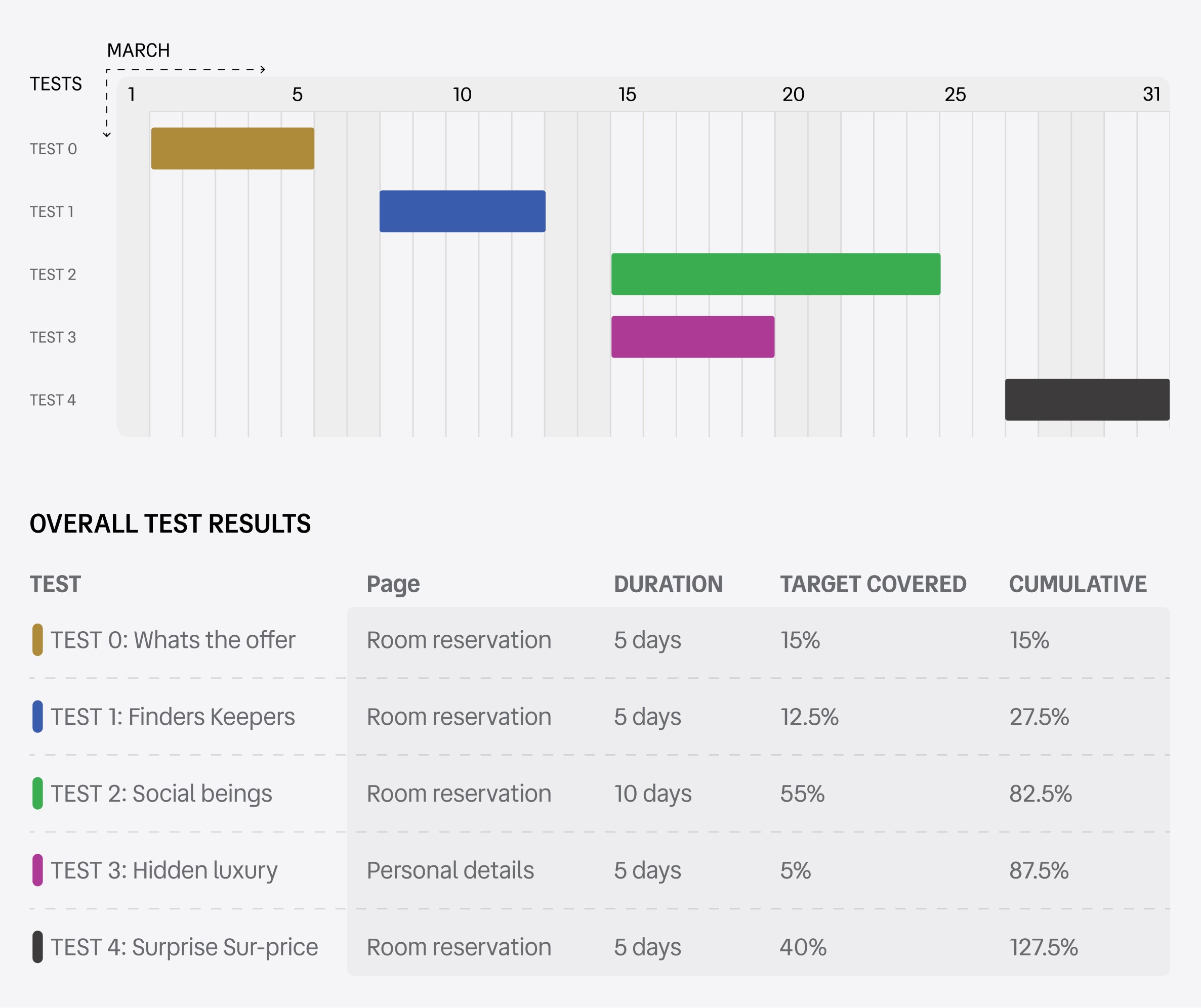
Five tests ran across March 2026 on two pages of the booking journey, and together they closed the shortfall and finished at 127.5% of target.
The distribution matters more than the total. Two tests carried the sprint: Social Beings at 55% and Surprise Sur-price at 40%, accounting for 95 of the 127.5 percentage points between them. The remaining three contributed 32.5% combined.
That parallelisation is the operational takeaway. Running tests concurrently on separate pages meant five experiments fit inside a single month without contaminating each other's results, which is what made the timeline viable at all.
The strategic takeaway is that the two winners both addressed the same underlying barrier. When the product cannot differentiate itself, other guests' behaviour becomes the differentiator, and the tests that made that behaviour visible outperformed the ones that adjusted presentation alone.
All figures shown are indicative. Actual numbers have been altered to protect confidential company data.
UX Strategy • Growth Direction • Design for impact
-Toshit sapahya (Former UX-Strategist @ Datavinci)
Collaborative • Thoughtful • Energizing
I've had the chance to work with Toshit, and he's one of those people who makes collaboration feel easy. As a UX Strategist, he brings strong ideas and approaches problems with a clear mindset. He's direct when giving feedback and just as open to receiving it. Beyond the work, he's easygoing, positive, and adds real energy to the team (bonus points for the guitar skills and a great voice). If you get the chance to work with him, take it.
Puja Kanwar
Project manager • Datavinci LLC

Dependable · Communicative · Adaptable
Toshit takes the time to fully understand what a task requires before diving in. If it means learning a new tool properly, he'll do that, even if it takes longer. He handles feedback without getting defensive, and he delivers quality work. He's also easy to work with, collaborates well with the team, and communicates clearly with clients.
Sachin Baheti
CRO Team Lead • Datavinci LLC
